Theme
Brand colours, fonts, card design, dark shops, and the effects that apply shop-wide.
Esta página aún no está traducida. Se muestra en inglés; todo lo que describe funciona igual en tu idioma.
Theme & Assets in the designer toolbar opens one window with two tabs. Theme adjusts brand colours, fonts and global design tokens — the values every block reads from. Assets looks after your pictures and videos (Images and videos). Below a wide screen the button shows only its paint brush.
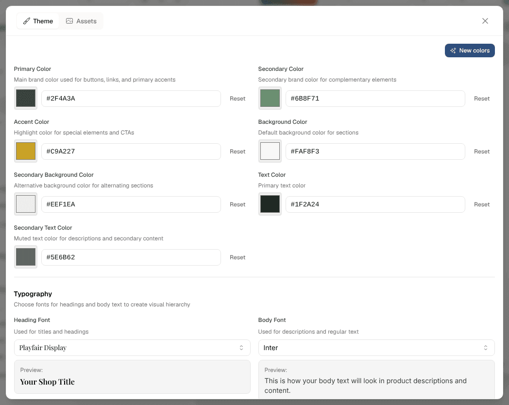
Your shop's colours and fonts are delivered inside the page, so the very first paint is already your shop's. Visitors never see the platform's default blue flash past before your palette arrives.
New colours and fonts from the AI
Regenerating the whole shop with the AI assistant keeps the colours and fonts your shop already has. New ones come from New colors at the top of Theme, which opens the window New colors and fonts from the AI:
- Write a note for the AI if you like — "warmer", "dark green as the main colour", "more elegant", "dark background". Without one, the AI decides.
- Click "Suggest new colors". It costs 2 AI credits.
The AI looks at what it looks at when it designs a new shop: the shop's name, description and About-us story, your products (categories, examples, price range), and on top of that the current colours and fonts and your note. The new colours and fonts go into a draft, and the preview shows them right away. Corners, shadows, the card design and every other setting on this panel stay as they are, a shop with a style preset gets colours and fonts that suit it, and a light shop stays light — a dark one dark — unless your note asks for the other. Not convinced? Click again: every click tries a different direction — warm, cool, bold colour blocks, tinted, monochrome. Or go back to the previous version in Version History. Visitors see the new colours once you publish.
Card Design
Which product card every product grid and products list draws:
| Design | Reads as | Typical for |
|---|---|---|
| Classic | The original rounded card with hover buttons | Toys, gadgets, general stores |
| Retail | A catalogue card: percent tag, stock line, brand + model, spec line, stars, icon buttons | Electronics, tools, B2B |
| Minimal | Large picture, quiet name and price; hover swaps to the second photo, plus a quick-add bar | Fashion, beauty |
| Editorial | Centred and airy, set in the heading font | Jewellery, art, furniture, luxury |
| Overlay | The picture is the card, caption on a dark scrim | Food, experiences, photography, prints |
| Compact | A horizontal row with a small picture and a filled cart button | Grocery, parts, books |
A grid or list block's Style tab shows the same chips with a globe/undo indicator, so one block can differ from the shop-wide choice and be reset back to it.
Card Size, Card Image Aspect, Card Text Alignment and Card Style apply to every design — a design without a card surface wears the border or shadow around its picture instead. The compact design widens its columns by itself.
Card Size offers S, M, L and XL. XL is meant for a shop that shows only a few products: the cards have no fixed width but share the row and fill it from edge to edge — three products become three large cards side by side, up to four in a row (a single product takes half the row, the compact design at most two). On a tablet or in a half-width block two stand side by side, on a phone one per row, and names and prices grow with them.
After “Add to cart”
What visitors see once they have put something into the cart is set once for the whole shop under After “Add to cart”:
- Window with “View cart” and “Continue shopping”: a small window shows what went in. “View cart” opens the cart panel, “Continue shopping” closes the window. A shop gets this until you choose otherwise.
- Open the cart: the cart panel slides open at once.
- Short notice: only a short notice at the edge of the screen.
Like the colours, the choice goes into a draft and reaches visitors when you publish. A page without a header has no cart panel to open, so it shows the short notice instead.
Making the shop dark
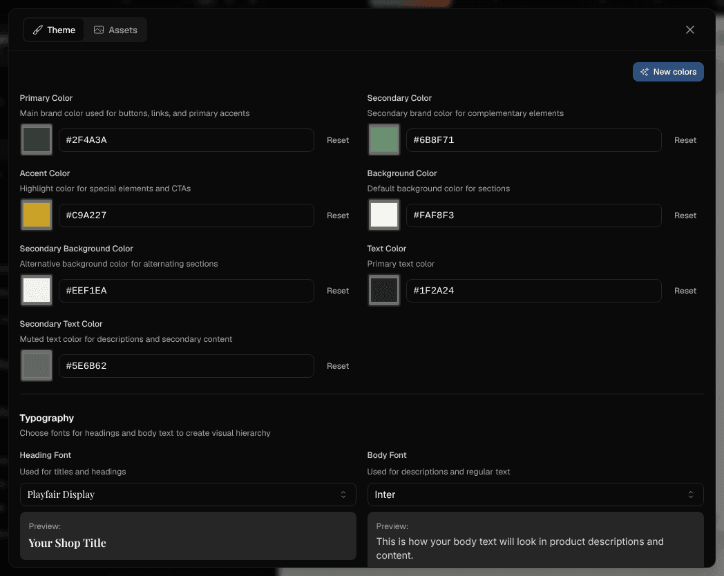
Asking the AI for a dark shop — "dark mode", "dunkler Hintergrund" — switches the theme itself: page background, secondary background, text and muted text all flip together, so every block follows at once instead of some sections staying light.
Brand colours, fonts and style tokens survive the switch, and the same works in reverse back to light.
A brand-new shop can also come out dark without being asked, when the AI finds that it suits the brand and the products — premium goods, coffee, night life, technology. Write "light" into your request if you want it light.
This is not the same as your dashboard's dark mode, which only affects what you see while working. The shop theme is what your visitors get.
Shop-wide effects
Two effects are set here and apply everywhere unless a block overrides them:
- Background Effect — decorative section atmosphere: falling shapes, aurora, glow orbs, dot and line grids, particles, waves, sparkles, bubbles, light rays, circuit lines, gradient drift, a starry sky, floating shapes, liquid shapes, a lamp (a cone of light in your accent colour falls from the top onto the title and opens the first time a visitor sees it), a vortex of glowing points slowly swirling in your colours, and light rain (fine beams fall down and burst into sparks at the bottom) — or none. The floating shapes take your picture shape; the stars shine light on a dark section and show as fine dust on a light one, and the lamp glows on a dark section and only tints a light one.
- Hover Effect for cards — lift, spotlight, tilt, glow, zoom — or none.
Both can be set per block in the Style tab of marketing blocks, and a Reset button there returns the block to the shop-wide value.
Right under the background effect sit the sliders for the whole shop: Amount, Size, Speed and Strength, each from 0 to 100 %, and the switches Shooting stars and Reacts to the mouse. At 50 % an effect looks as it always has. They apply to the effects of every block that has not set its own in its Style tab, whichever effect the block shows, and the arrow beside a moved slider takes it back to 50 %. A style preset leaves them as they are.
Effects are automatically disabled for visitors whose device asks for reduced motion.
Style presets
A Style Preset sets the whole look at once: corners, shadows, button size, how cards react to the mouse, the four switches below (buttons, frames, lines, surface), the title look and a pair of fonts. In the design section every preset shows a small preview card in your own colours, and the active one is marked.
| Preset | What it looks like |
|---|---|
| Minimal | lots of white space, fine lines, no shadows |
| Modern | clear shapes, pill buttons, light shadows |
| Playful | round shapes, big buttons, playful fonts, waves, blob pictures, titles that run into the accent colour |
| Elegant | serifs, italic titles, fine lines, framed pictures |
| Bold | huge titles, big buttons, strong shadows, slanted edges |
| Corporate | calm, factual, square buttons |
| Edgy | thick frames, hard shadow, no rounding, zigzag edges, slanted pictures, outlined titles |
| Magazine | big serif titles with a highlighter, dividing lines, underlined links, black-and-white pictures |
| Retro | paper grain, thick frames, buttons with a hard shadow, torn paper, round warm pictures |
| Nature | soft shapes, arched edges, paper grain, italic serifs, arched pictures |
| Night | dark shop, fine lines, cards with a glowing edge, pictures in the brand colour, titles that run into the accent colour |
Your colours stay. Only Night turns a light shop dark; pick another preset before saving and the light colours come back. Clicking the same preset again tries its next pair of fonts, and afterwards you can change every setting on its own.
A new shop gets its preset from the AI, chosen to suit its colours and products, so two similar shops usually end up on different presets. New colors keeps to the preset and looks for colours and fonts that suit it. A shop designed before the presets existed keeps its look until you pick one.
Edges between sections
Section Edges in the design section shapes the edge where a section meets one in another colour above it: straight (as before), a wave, a slant, an arch, a zigzag or torn paper. The edge is cut out of the lower section, so it has that section's own colour, picture, grain and background effect, and every other edge on a page runs the other way.
An edge only shows where the colour changes. Two sections in the same colour stay as they are, and so do the header, the first section under it, the heroes and the two halves of a half-width pair. On a phone the edges are smaller.
Five presets bring an edge along: Playful waves, Bold slants, Edgy zigzags, Retro torn paper and Nature arches. The other presets set it back to straight. A single section can have its own edge too: Top Edge in its Style tab.
Picture shapes and filters
Picture Shapes in the design section cuts the mood pictures of the shop to a shape: as they are, an arch, a circle (an oval on a picture that is not square), a blob, a frame like a printed photo or a slant. Picture Filters lays a look over the same pictures: none, mono (black and white), duotone (tinted in your brand colour) or warm like an old print. A film in the same place takes the filter too.
Mood pictures are the pictures beside or under the words of a hero, in feature blocks with pictures, in the masonry, strip and grid galleries, in the call to action with a picture, in the scroll stories and the store picture of the location block. Product pictures never change: product cards, product pages and product galleries always show the product as it is. Pictures behind text, pictures that fill a whole half of a block, slideshows, before-and-after pictures and portraits keep their shape too. Where a circle or a blob cuts the corner, the “AI-generated” label moves inwards.
Seven presets bring a look along: Playful blobs, Elegant frames, Edgy slants, Retro round, warm pictures, Nature arches, Magazine black and white and Night pictures in the brand colour. The other presets set both back. A single block can have its own: Picture Shape and Picture Filter in its Style tab, on the blocks whose pictures can take them.
Buttons, frames, lines and surface
Four switches in the Design area change the whole shop at once:
- Button shape — Normal, Pill (fully round), Square, Hard shadow (a dark outline with an offset shadow, like print) or Underlined: links such as “Shop now” become underlined words. Buttons that do something — add to the cart, pick a size, send a form — stay buttons and only lose their rounded corners.
- Frames — around cards, boxes and product cards: Normal, Fine line, Thick line, Offset shadow or Glowing edge: a border in your shop colours slowly turns round the card, with a soft glow (it stands still for visitors who asked their device for less motion). A frame replaces the soft shadows.
- Lines — Fine draws a fine line between the sections of the page (not under the header) and between the two halves of a half-width pair.
- Surface — Paper lays a paper texture over the background of the sections, Grain a fine grain. The texture sits on the backgrounds only, never on photos; sections with a gradient stay smooth.
A single block can have its own: its Style tab shows the same rows, on the blocks that draw buttons, cards or a background, with Line above instead of Lines. Each starts at As in the shop, and the block then follows the switches here. Whatever you pick there applies to that block only, Normal too: a block can keep plain buttons in a shop of pills. In a half-width pair the line belongs to the pair, and one half asking for it draws it.
Like the colours, the switches land in a draft and reach visitors once you publish.
Motion
Four switches under Motion in the design section make the whole shop move:
- Mouse Pointer — a Dot in your brand colour takes the place of the visitor's pointer; a Ring follows the mouse a moment behind, around their own pointer. Both grow over links and buttons.
- Magnetic Buttons — buttons lean a little towards the mouse while it is over them.
- Scroll Depth — mood pictures move a little slower than the page as visitors scroll, Soft or Strong, which gives the page depth. These are the pictures that take a picture shape, and photos behind sections; product pictures never move.
- Progress Bar — a thin bar in your brand colour along the top of the screen fills up as visitors scroll down.
Magnetic Buttons and Scroll Depth can be set per block too: the block's Style tab shows them on the blocks with buttons or with pictures that can move. They start at As in the shop; whatever you pick there applies to that block only, so a single block can stay still in a moving shop, or move in a still one.
The mouse effects run only with a mouse: never on a phone or a tablet, never for visitors whose device asks for reduced motion, and not while you work in Edit Mode. Scroll depth also stays still for reduced motion and in browsers that cannot do it yet; the pictures then simply scroll with the page.
Some presets bring motion along: Playful a dot, Bold and Night a ring, all three with magnetic buttons; Modern, Elegant, Nature, Night and Magazine soft depth, Bold strong depth; Magazine and Edgy the progress bar. The other presets switch it all off.
Fonts
Headings and body text take separate faces. Every heading — h1 to h6 —
takes the heading face by rule, so a heading rendered by a script looks like
one rendered by the server. A card design that deliberately wants the body face
on its title says so itself.
There are 61 fonts to choose from: plain ones for long text and faces with character for titles — wide, condensed, fat retro serifs, fashion serifs, marker pens.
Title look, under the heading font, sets every title of the shop at once:
- Normal — as the font comes.
- CAPITALS — capital letters with a little air between them.
- Italic — the font's italic. Fonts without a real italic are slanted by the browser, which looks best with serif fonts.
- Big and tight — the large titles a size up, lines and letters pulled close.
A single block can have its own: Title look in its Style tab starts at As in the shop, and whatever you pick there sets that block's titles only, Normal too: one block can keep plain titles in a shop of capitals.
Its faces too: Heading Font and Body Font in the Style tab list the same fonts, with the shop's own first. A face a block picks loads only on the pages that show the block, so the rest of the shop stays as fast as before.
A new design from the AI picks the title look together with the fonts, and so does New colors.
Title effects
Title Effects in the design section changes how the big titles of the shop are lettered:
- as they are, in their colour;
- as a gradient that runs from the title's colour into your accent colour;
- as outlined letters: only the outline of the letters is drawn and the background shows through. Heavy fonts suit it best;
- with a Highlighter: as soon as the title comes into view, a stroke in your accent colour sweeps over its last word. Highlighter, whole title marks every word. A title further down the page waits until the visitor gets there; for visitors who asked their device for less motion the stroke is simply there.
It changes the big titles of the sections: heroes, features, calls to action, statements, FAQs, galleries and the like. The header and the footer, the product and blog post blocks and the marquee keep their titles as they are, and so do the statement whose words fill in while scrolling and the one with pictures in the text, which colour their own words. A title that rises word by word keeps its gradient across all its words.
Four presets bring an effect along: Playful and Night gradients, Edgy outlines, Magazine the highlighter. The other presets set it back. A single block can have its own: Title Effect in its Style tab.
Adding a colour or a font
New theme colours and faces are part of the platform rather than something you add per shop. If a face you need is missing, open a ticket — a missing feature that we ship is worth 30 AI credits.