Edit mode
Inline text and image editing, and every tab of the block editor's side panel.
Esta página aún no está traducida. Se muestra en inglés; todo lo que describe funciona igual en tu idioma.
The Edit Mode button in the toolbar (pencil icon) turns the preview into an editor: text becomes editable where it stands, and image slots become replaceable.
Selecting a block in Edit Mode opens a side panel with four icon tabs.
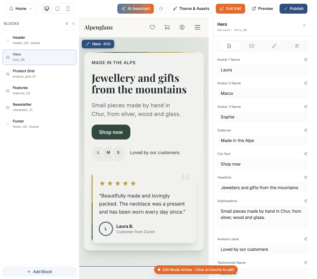
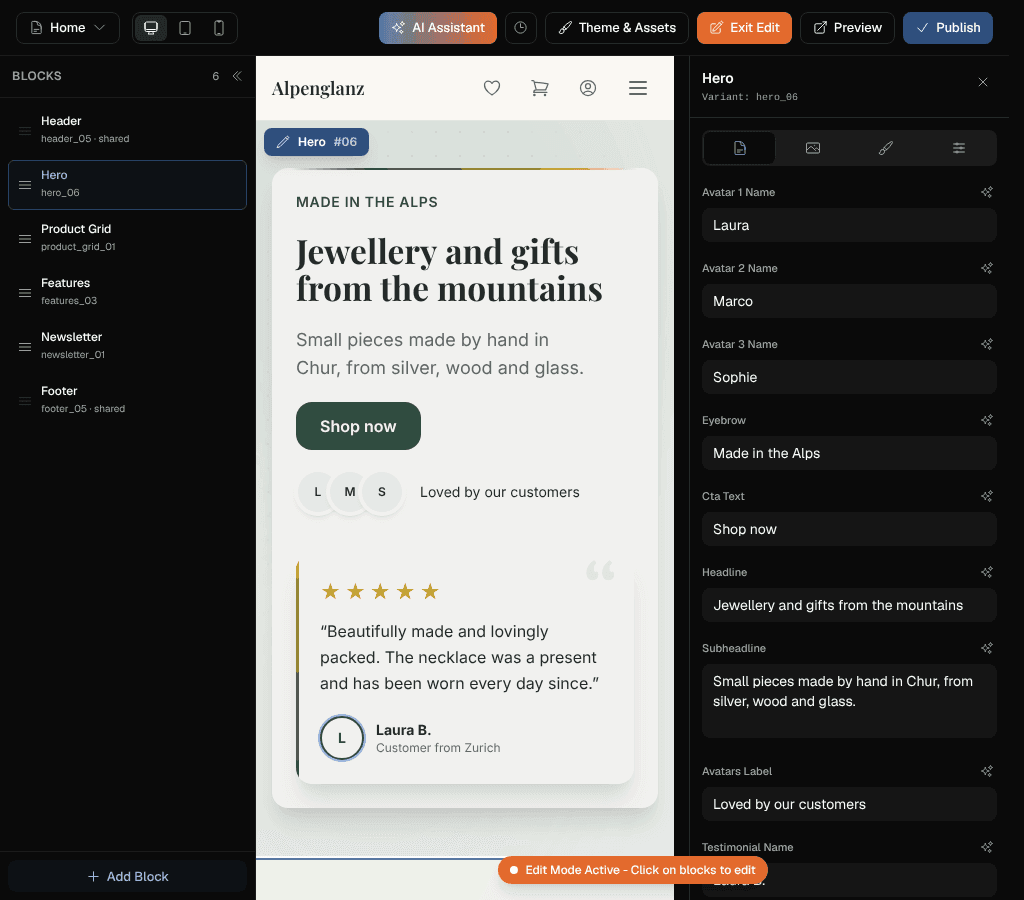
Text
The block's headlines, body copy, button labels and captions.
Links
Blocks that link somewhere — cards in a content grid, hero and CTA buttons, the view all button of a product grid — get a Links section at the bottom of the Text tab. One dropdown per link, listing:
- your shop's own pages, plus Shipping and Legal
- No link — hides that button entirely; a card without a link stays visible but stops being clickable
- one entry per block of the page you are editing, as “On this page: Products List · Our jewellery” — the button then scrolls down (or up) to that block instead of opening a page. Header, footer and the block the button sits in are not offered. Picking a block gives it a short name of its own (from its headline), which is saved with the button
- Custom URL… — an external address, or a
#anchoryou type yourself; a#anchorno block of the page carries is flagged under the field
Blocks the AI writes — a whole shop, a new page, an added or replaced block — set such jumps themselves: a hero above the page's product list scrolls down to it instead of loading the same page again.
Only pages that actually have blocks are offered, and a link still pointing at a page that has since gone is flagged in the dropdown.
Deleting a page in Manage pages switches off every link to it across the whole shop, and the modal reports how many. Renaming a page repoints them. Both happen in the designer version only — the live shop follows on the next Publish.
Images
Replace, upload, pick from your assets, or AI-generate. Image slots can also hold videos. See Images and videos. The film icon next to the AI button asks the AI for a short film of one of your pictures, see Films from the AI.
Blocks with an image gallery — the gallery hero and the two standalone gallery blocks (masonry columns and horizontal strip) — get a grid editor here to add, replace, remove, reorder or AI-generate images up to the block's maximum.
The standalone gallery blocks take up to 16 images, no matter how many the AI originally created, and their grid editor also edits each image's alt text and caption. Captions appear in the shop when the block's Show Captions toggle is on; an image with no caption of its own falls back to its alt text, so the toggle always shows something.
Colors
The block's own colour choices, drawn from your theme.
When a section's background uses the same theme colour as a button on it — a primary-coloured button on a solid primary section — the button automatically inverts to white so it stays readable. On the light and lighter background tints it keeps its normal colours.
Style
Style options are set with icon buttons and choice chips, never dropdowns, grouped into six sections: Display, Cards, Typography, Layout, Appearance and Effects. Display holds the block's own switches, Cards the ones for each product card.
The option names in this tab and the words on its choice chips speak your dashboard language — Card Alignment, Bordered, Slow and the rest.
Options you will meet often
Effects
Background Effect (decorative section atmosphere) and Hover Effect for cards can be set per block on marketing blocks — hero, CTA, features, testimonials, newsletter, content grid, FAQ, statement, trust bar, gallery, sticky showcase. A per-block choice overrides the shop-wide one set in the Theme, and a Reset button returns the block to the global value.
Right under the background effect sit its sliders: Amount, Size, Speed and Strength, each from 0 to 100 %. At 50 % the effect looks as it always has; 0 % is very little but never nothing, 100 % about twice as much. Only the sliders that change something on the chosen effect are shown (the dots, for example, do not move, so they have no speed). The stars also have a switch for Shooting stars, the particles one for Reacts to the mouse. Every slider and switch starts at As in the shop, the value set under the background effect in the Theme; once you move it, it applies to this block alone, and the arrow beside it takes it back. The designer's AI knows the sliders too: a wish such as "more and bigger stars in the hero" or "calmer everywhere" is enough, and it sets them for you.
Effects are automatically disabled for visitors whose device asks for reduced motion.
Animation
A block's entrance animation — Animation, Animation Speed, Animation Delay — starts at first paint, so content at the top of the page fades in before any JavaScript has run. Nothing is ever hidden in the page's HTML, which matters for search engines.
Two of the animations are made for titles. Word by word fades the block in while its big title rises word by word, each word a moment after the one before. Blur brings the whole block in softly out of a blur. A title written on several lines, or one with a link or bold words in it, rises whole. Visitors who turned motion off see the block at once, as with every animation.